Re-Composing our Apps: Inside the Android chapter
If you've been keeping up to date for the last few years you've definitely heard of Jetpack Compose!
In case you haven't, here's a quick explanation. In Google's words:
"Jetpack Compose is Android’s recommended modern toolkit for building native UI. It simplifies and accelerates UI development on Android. Quickly bring your app to life with less code, powerful tools, and intuitive Kotlin APIs."
Simply put, you can now write your UI using Kotlin instead of XML!
Why Jetpack Compose is better
- Simplicity (Less complexity, simpler state handling)
- Performance
- Easier to make simpler UI structures
- By design compose avoids re-composing (re-drawing) the UI as much as possible
- Interoperability (fully interoperable with XML)
- Easy navigation
- Live Edit
- Easy animations
At Vodafone, we are always looking for ways to improve our apps, leveraging new technologies and learning along the way! So, we decided to plan the migration of our views from XML to Compose.
Migration from XML to Compose
Migrating to Compose has been surprisingly easy!
Dependencies
As always in Android, we begin by adding libraries! Fortunately, we can use the Bill Of Materials to make things easier:
dependencies {
    // Specify the Compose BOM with a version definition
    val composeBom = platform("androidx.compose:compose-bom:2024.06.00")
    implementation(composeBom)
    testImplementation(composeBom)
    androidTestImplementation(composeBom)

    // Specify Compose library dependencies without a version definition
    implementation("androidx.compose.foundation:foundation")
}
A list of supported dependencies can be found here.
Theming
We then started the migration by creating a theme for Compose.
To simplify things initially we used Accompanist to link our compose theme to our old XML theme as is.
The code is now deprecated but it looked like this:
val context = LocalContext.current
var (colors, type) = context.createAppCompatTheme()

MaterialTheme(
    colors = colors,
    typography = type
) {
    // rest of layout
}
The function createAppCompatTheme() will use your currently defined xml styles to create compose objects that can be passed to a compose theme. This saved us time as we did not need to maintain 2 themes.
After a few screens were migrated we then proceeded to create a new theme for Compose using Material 3 to break away from our old XML theme:
@Composable
fun AppTheme(
    isDarkTheme: Boolean = isSystemInDarkTheme(),
    content: @Composable () -> Unit
) {
    val colorScheme = if (isDarkTheme) darkColorScheme else lightColorScheme

    MaterialTheme(
        colorScheme = colorScheme,
        shapes = shapes,
        typography = typography,
        content = content
    )
}
Screen composition
The next step was to slowly convert XML screens to compose while carefully monitoring to avoid errors.
This allowed us to incrementally learn how our current UI can be recreated in Compose. The process was quite straightforward since we already followed the MVVM architecture before this migration. For navigation we decided to keep using fragments - meaning we only replaced the view binding inside the fragment.
Below I will describe how a current screen looks like for us. If you have used adapter delegates by Hannes Dorfmann our compose screens might look familiar!
Our screen consists of
- a Fragment
- a ViewModel
- a UI state class
- a UI transformer
- a composable.
Our fragment looks like this:
class EshopFragment : BaseFragment() {

    @Inject
    lateinit var viewModelFactory: ViewModelFactory

    private val viewModel: EshopViewModel by viewModels(factoryProducer = { viewModelFactory })


    override fun onCreateView(
        inflater: LayoutInflater,
        container: ViewGroup?,
        savedInstanceState: Bundle?
    ): View {
        return ComposeView(requireContext()).apply {
            layoutParams = ViewGroup.LayoutParams(MATCH_PARENT, MATCH_PARENT)
            setViewCompositionStrategy(ViewCompositionStrategy.DisposeOnViewTreeLifecycleDestroyed)
            setContent {
                AppTheme {
                    EshopPage(::handleEvent).View(state = viewModel.state)
                }
            }
        }
    }

    override fun onViewCreated(view: View, savedInstanceState: Bundle?) {
        super.onViewCreated(view, savedInstanceState)
        viewModel.fetch()
    }

    private fun handleEvent(event: EshopUiEvent) {
        when (event) {
            EshopUiEvent.Close -> {
                ...
            }
            is EshopUiEvent.OpenUrl -> {
                ...
            }
        }
    }


    companion object {
        fun newInstance(): EshopFragment {
            return EshopFragment()
        }
    }
}
As you can see it is a very simple Fragment. It is only needed as we have not yet migrated to compose navigation and we need fragments to navigate to our new screens.
Our state class:
@Stable
class EshopState {
    var uiState: State by mutableStateOf(State.None)

    sealed interface State {
        data object None : State
        data object Loading : State
        data object Error : State
        data class Data(
            val viewData: PersistentList<UiViewData>
        ) : State
    }
}
The @Stable indicates a type whose properties can change after construction. If and when those properties change during runtime, Compose becomes aware of those changes (check compose stability). This helps avoid unnecessary re-compositions.
The Data state contains a list of UiViewData. This interface was created to delegate view creation to different classes. In this manner, we can have generic, reusable views as needed.
interface UiViewData {

    /**
     * Type identifier for lazy column/row.
     * This is required so that a view can be reused
     */
    fun getType(): Any = this::class.simpleName ?: this::class.java

    /**
     * Unique identifier for lazy column/row
     * Warning: If this is not unique the app will crash
     */
    fun getKey(): Any = hashCode()
}


interface UiHeaderViewData : UiViewData

interface UiFooterViewData : UiViewData
This interface can then be processed by a UiView:
interface UiView {

    fun isValidForView(data: UiViewData): Boolean

    @Composable
    fun View(position: Int, data: UiViewData)

}
Each UiView is responsible for assessing if a UiViewData instance is valid for this view. As an example, the following is a generic text view used on most our screens:
data class GenericTextViewData(
    val containerParams: ContainerParams = ContainerParams(),
    val textAttribute: TextAttribute
) : UiViewData {
    private val _key by lazy { UUID.randomUUID().toString() }
    override fun getKey() = _key
}


class GenericTextView : UiView {

    override fun isValidForView(data: UiViewData) = data is GenericTextViewData

    @Composable
    override fun View(position: Int, data: UiViewData) {
        data as GenericTextViewData

        Box(
            modifier = Modifier
                .then(data.containerParams.size.toSizeModifier(Modifier.fillMaxWidth(), null))
                .then(data.containerParams.outerColors.toBackgroundModifier())
                .then(data.containerParams.outerPadding.toPaddingModifier())
        ) {
            Text(
                modifier = Modifier
                    .fillMaxWidth()
                    .align(data.textAttribute.alignment.toAlign())
                    .then(data.containerParams.innerColors.toBackgroundModifier())
                    .then(data.containerParams.innerPadding.toPaddingModifier()),
                text = data.textAttribute.text,
                style = data.textAttribute.makeTextStyle(),
                overflow = data.textAttribute.overflow ?: TextOverflow.Visible,
                maxLines = data.textAttribute.maxLines ?: Int.MAX_VALUE
            )
        }
    }
}

@Preview
@Composable
private fun PreviewGenericTextView() = AppTheme {
    GenericTextView().View(
        0,
        data = GenericTextViewData(
            textAttribute = TextAttribute(text = "Text", color = Color.White)
        )
    )
}
To make it clear how these are used here's our main view:
class EshopPage(
    private val eventHandler: (EshopUiEvent) -> Unit
) {

    @Composable
    fun View(state: EshopState) {
        when (val uiState = state.uiState) {
            State.Error -> {
                GenericErrorViewWhite(
                    data = GenericErrorViewData(
                        header = stringResource(id = R.string.eshop_title),
                        reason = stringResource(id = R.string.eshop_error_title),
                        message = stringResource(id = R.string.eshop_error_description)
                    ),
                    onClose = { eventHandler.invoke(EshopUiEvent.Close) }
                )
            }

            State.None, State.Loading -> {
                LoaderFullPageRed(
                    Modifier
                        .fillMaxSize()
                        .background(monochrome2),
                    blackNewPalette
                )
            }

            is State.Data -> {
                MainView(Modifier.fillMaxSize(), uiState.viewData)
            }
        }
    }

    @OptIn(ExperimentalFoundationApi::class)
    @Composable
    private fun MainView(
        modifier: Modifier = Modifier.fillMaxSize(),
        viewData: PersistentList<UiViewData>
    ) {
        val viewList: PersistentList<UiView> = listOf(
            GenericTextView(),
            EshopHeaderView(eventHandler),
            EshopCategoriesView(eventHandler),
            EshopFooterLinksView(eventHandler)
        ).toPersistentList()

        LazyColumn(
            modifier = modifier.background(monochrome2)
        ) {
            val headers = viewData.filterIsInstance<UiHeaderViewData>()
            headers.forEach {
                stickyHeader(contentType = it.getType()) {
                    Item(-1, it, viewList)
                }
            }

            itemsIndexed(
                viewData.filterNot { it is UiHeaderViewData },
                contentType = { _, item -> item.getType() },
                key = { _, item -> item.getKey() }
            ) { index, item ->
                Item(index, item, viewList)
            }

            item { Spacer(modifier = Modifier.height(32.dp)) }
        }
    }

    @Composable
    private fun Item(
        index: Int,
        item: UiViewData,
        viewList: PersistentList<UiView>
    ) {
        viewList.find { it.isValidForView(item) }?.View(index, item)
    }
}
All that's needed to create the screen is a LazyColumn (the equivalent to a vertical recycler view) and the list of views that can display the data provided.For each UiViewData object provided the Item method will loop through the views to find the proper one.
Our ViewModel is also very simple and handles fetching the data for the screen:
class EshopViewModel(
    private val fetchUseCase: EshopPageUseCase,
    private val dispatchers: CoroutineDispatchers,
    private val uiTransformer: EshopUiTransformer
) : ViewModel() {

    val state = EshopState()

    fun fetch() {
        viewModelScope.launch(dispatchers.io()) {
            update { state.uiState = State.Loading }

            val resp = fetchUseCase.fetch()

            if (resp == null) {
                update {
                    state.uiState = State.Error
                }
            } else {
                val transformed = uiTransformer.transform(resp).toPersistentList()
                update {
                    state.uiState = State.Data(transformed)
                }
            }
        }
    }


    private suspend fun update(body: () -> Unit) = withContext(dispatchers.main()) {
        body()
    }

}
The UI transformer is then responsible for converting our eshop domain model to a list of UiViewData (for simplicity most transformations were removed):
class EshopUiTransformer(private val resourceRepository: ResourceRepository) {

    fun transform(model: EshopModel): List<UiViewData> {
        val data = mutableListOf<UiViewData>()

        // Header
        model.headerImage?.let {
            data += EshopHeaderViewData(
                containerParams = ContainerParams(
                    outerColors = ContainerColors(backgroundColor = redGuardsman),
                    size = ContainerSize(Modifier.fillMaxWidth(), Modifier.height(80.dp))
                ),
                background = it,
                title = TextAttribute(
                    text = resourceRepository.getString(R.string.eshop_title),
                    color = white
                )
            )
        }

        // Title
        model.title?.let {
            data += GenericTextViewData(
                containerParams = ContainerParams(
                    outerPadding = ContainerPadding(
                        top = 32.dp,
                        start = 16.dp,
                        end = 16.dp
                    )
                ),
                textAttribute = TextAttribute(
                    text = it,
                    fontWeight = FontWeight.Bold,
                    size = 24F,
                    color = blackNewPalette
                )
            )
        }

        // Description
        model.description?.let {
            data += GenericTextViewData(
                containerParams = ContainerParams(
                    outerPadding = ContainerPadding(
                        top = 16.dp,
                        start = 16.dp,
                        end = 16.dp
                    )
                ),
                textAttribute = TextAttribute(
                    text = it,
                    fontWeight = FontWeight.Normal,
                    size = 16F,
                    color = blackNewPalette
                )
            )
        }

        return data
    }
}
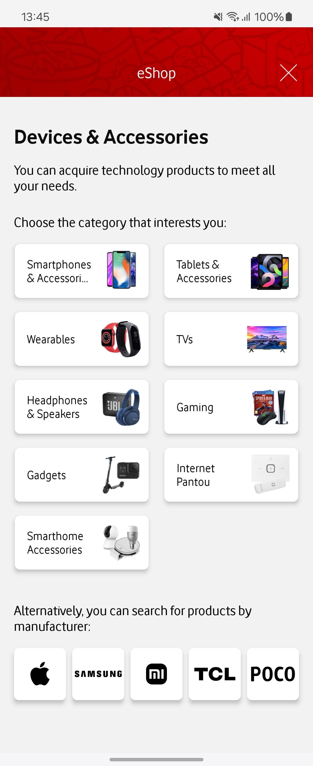
This is the resulting screen:
Static code analysis
After a few screens had been converted, we added static code analysis for compose using detekt in order to more easily spot any mistakes. We used this plugin for the rules: https://mrmans0n.github.io/compose-rules/detekt/. These rules are also part of our CI process and are required to pass for a PR to be merged.
Learning curve
Due to its interoperability and very extensive documentation and feature set, the learning curve for compose has not been a problem. It is a mindset shift from the old system, however, once you have created your first screen and gotten over the shock, it all works as expected!
Current status
At this time, every member of our team has implemented more than 1 screen in compose and they are comfortable enough using it.
Jetpack compose is now our default for any new feature! 👏🎉
Future steps
In the future, we plan to adopt Compose navigation for our screens to finish our migration. This will allow us to avoid having fragments for our navigation and simply use a viewmodel and a composable function as well as simplify our navigation logic.
Helpful stuff!
What helped a lot during the migration is that Compose is fully interoperable with XML views. This means you can use XML views in compose and vice versa!
Using an XML view in a composable:
AndroidView(
    factory = { context ->
        TextView(context).apply {
            movementMethod = LinkMovementMethod.getInstance()
        }
    },
    update = {
        it.text = htmlDescription
    }
)
Using Compose in XML:
<LinearLayout xmlns:android="http://schemas.android.com/apk/res/android"
    android:orientation="vertical"
    android:layout_width="match_parent"
    android:layout_height="match_parent">

  <TextView
      android:id="@+id/text"
      android:layout_width="wrap_content"
      android:layout_height="wrap_content" />

  <androidx.compose.ui.platform.ComposeView
      android:id="@+id/compose_view"
      android:layout_width="match_parent"
      android:layout_height="match_parent" />
</LinearLayout>
class ExampleFragmentXml : Fragment() {
override fun onCreateView(
inflater: LayoutInflater,
container: ViewGroup?,
savedInstanceState: Bundle?
): View {
val view = inflater.inflate(R.layout.fragment_example, container, false)
val composeView = view.findViewById<ComposeView>(R.id.compose_view)
composeView.apply {
// Dispose of the Composition when the view's LifecycleOwner
// is destroyed
setViewCompositionStrategy(ViewCompositionStrategy.DisposeOnViewTreeLifecycleDestroyed)
setContent {
// In Compose world
MaterialTheme {
Text("Hello Compose!")
}
}
}
return view
}
}
Further Reading
- Compose testing: https://developer.android.com/develop/ui/compose/testing